Designing a unified workflow to get patients on therapy faster
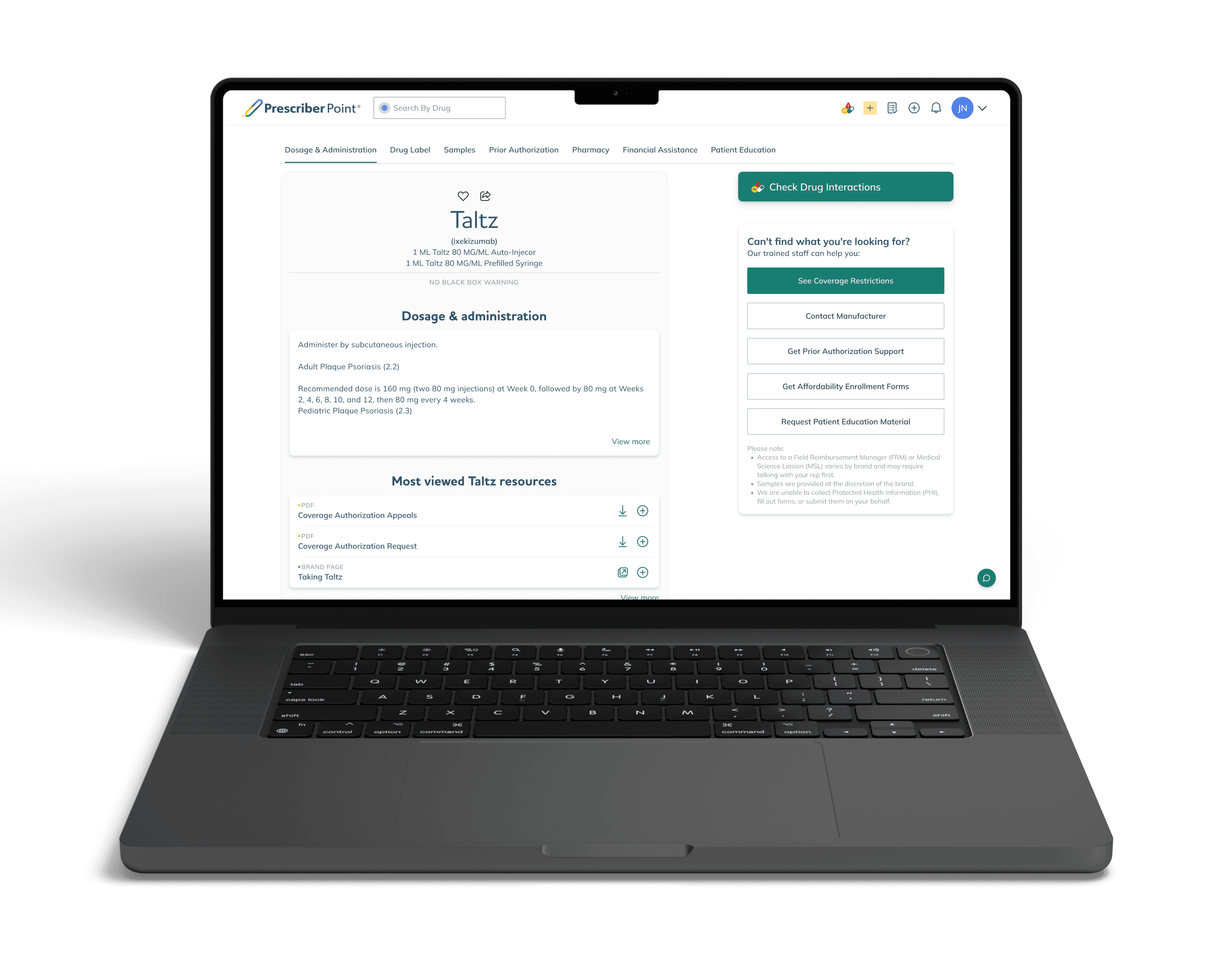
Healthcare providers spend countless hours navigating disconnected systems for coverage, affordability, prior authorization, dosing, and therapy initiation. At PrescriberPoint, I led the 0 to 1 design of a platform that brings these fragmented steps into a single cohesive workflow. The goal was to reduce cognitive load, eliminate unnecessary steps, and help providers make confident treatment decisions right at the point of care.
Over a year and a half, I designed the platform’s core experiences. This included onboarding, drug information architecture, therapy initiation tools, and an AI-assisted coverage lookup that helped the team ship an end-to-end product that improved speed, accuracy, and provider satisfaction.

The Problem
Starting a patient on specialty medication is complex. Providers must answer questions such as:
Is the drug covered
What is the prior auth requirement
What dosing is appropriate
What forms need to be completed
Are there copay or affordability programs available
These answers are usually scattered across PDFs, manufacturer sites, payer portals, rep-provided materials, and internal notes. Providers often piece together information manually, which leads to delays in care and significant administrative burden. Our challenge was to build a platform that not only centralized information but guided providers through the required steps with clarity and precision.
My Role
Senior UX Designer
Led a research team across prescribers, medical assistants, hubs, and internal stakeholders
Directed workflow mapping and synthesis to define the foundation of the platform
Designed platform IA and navigation
Led onboarding redesign from 12 steps to 3
Reimagined the therapy product page into an action-focused workflow
Designed an AI-driven coverage lookup experience
Collaborated with engineering, clinical experts, and product partners
Delivered production-ready flows from wireframes to final UI
Designing the AI Clinical Assistant
The Problem
Providers were spending significant time switching between payer portals, PDFs, and internal notes to answer therapy-specific questions such as prior authorization requirements or documentation criteria. This created friction inside coverage and PA workflows and slowed therapy initiation.
The Opportunity
We identified an opportunity to embed contextual AI directly within the therapy workflow to surface structured, actionable answers in real time. The goal was to reduce context switching and transform information retrieval into decision support.
My Role
• Defined use cases and scoped AI interactions
• Designed a hybrid conversational + structured response model
• Mapped AI outputs to real clinical workflows
• Partnered with engineering on prompt constraints and fallback logic
• Designed confidence indicators and source transparency for trust calibration
Structured Outputs Over Raw Chat
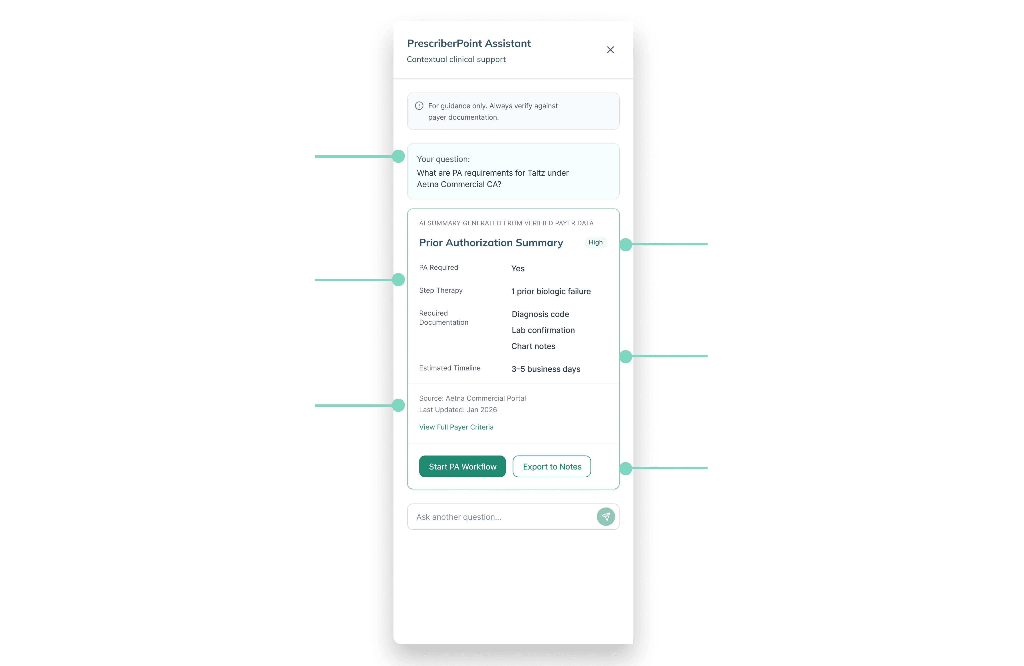
Instead of returning paragraph-based chat responses, I designed structured response templates aligned to clinical workflows. This enabled scannability and immediate action.
Because this operates in a clinical environment, trust calibration was critical. I designed subtle confidence indicators and clear source attribution to help providers interpret AI output appropriately.

Context-Aware Ingestion
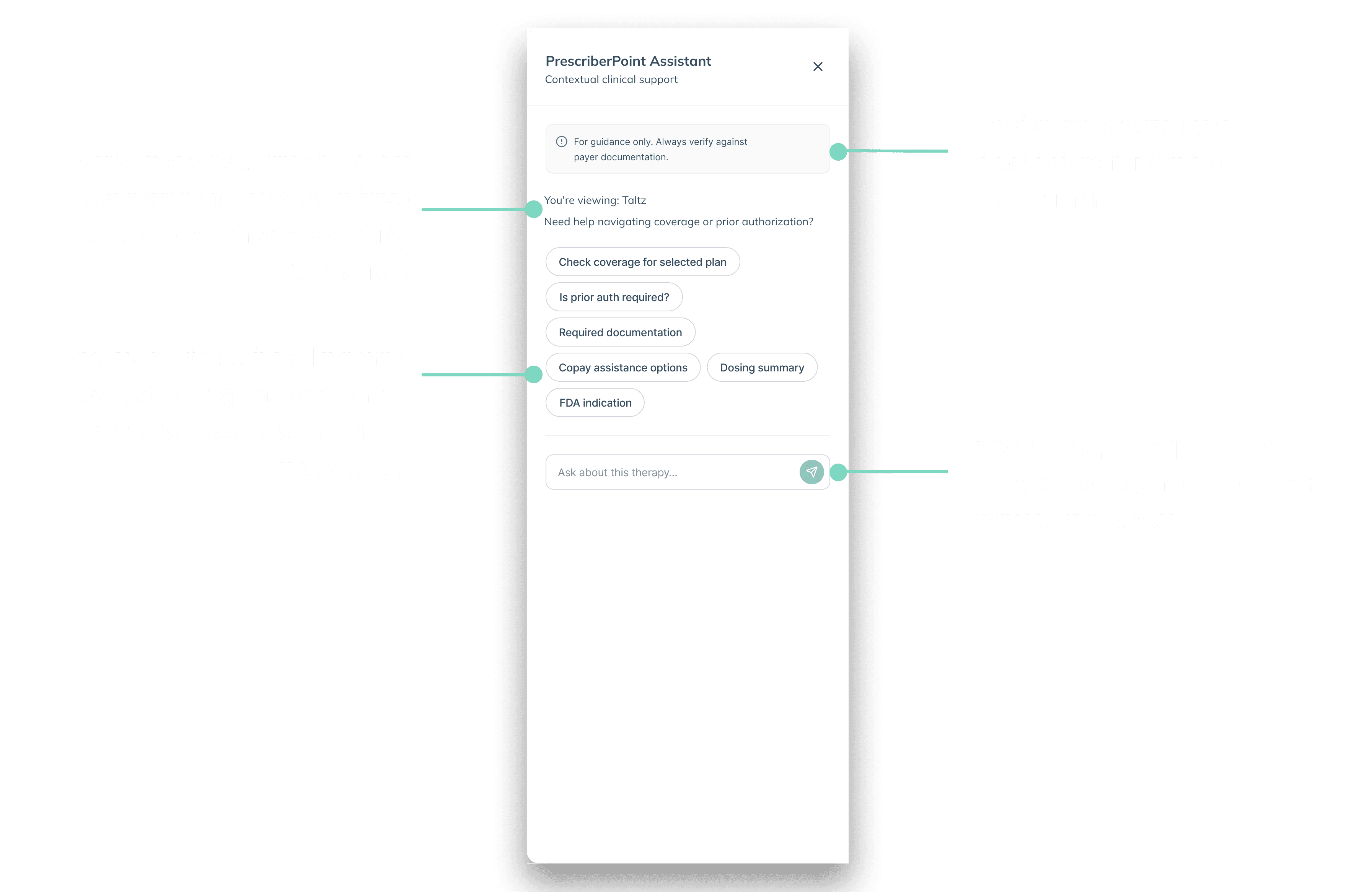
The assistant ingests the active therapy context, reducing prompt friction and preventing ambiguous queries. Providers never have to restate drug context. I also introduced guided intent chips for common clinical tasks such as coverage checks and required documentation to reduce typing and anchor AI responses to validated use cases.

Designing for Missing Context and Safe Fallbacks
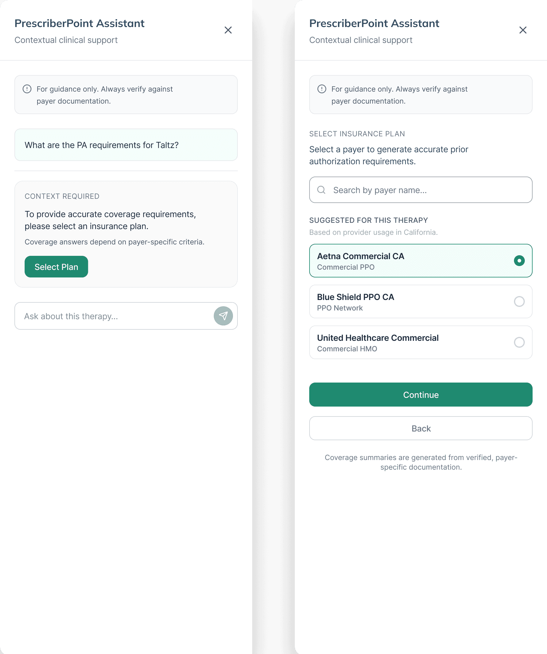
In coverage workflows, payer context is essential. The assistant detects when a user asks:
“What are the PA requirements for Taltz?”
Without an insurance plan selected, it responds with a structured prompt to select a payer rather than generating a generic answer.
This design decision ensures:
• AI responses are grounded in verified payer-specific documentation
• Providers remain inside validated workflow states
• The system avoids hallucinated or incomplete guidance

Impact
This initiative transformed information retrieval into workflow-level decision support. By combining contextual awareness, structured outputs, and guardrails, the assistant improved coverage verification speed while reinforcing safety and trust in a regulated clinical environment.
Streamlining Onboarding
The original onboarding process included 12 steps, redundant questions, unclear terminology, and unnecessary verification loops.
Approach
Audit and Mapping
Analyzed the original onboarding flow step by step
Identified redundancies, confusion points, and friction patterns
Research and Feedback
Interviewed providers to understand what information truly mattered at account creation
Reviewed completion data to pinpoint drop-off moments
Collaboration
Worked with product to ensure compliance needs were met
Partnered with engineering to safely remove unneeded steps
Outcome
Reduced onboarding from 12 screens to 3:
Account creation and email verification
Minimal required profile information
Optional coworker invitations
This created a lighter first-time experience and significantly improved completion rates and early engagement.


Redesigning the Therapy Product Page


Research-driven workflow mapping
To design the coverage and prior authorization system, I led more than 60 interviews and shadowing sessions with prescribers, medical assistants, prior auth coordinators, and specialty pharmacy staff. Our goal was to understand the true workflow behind getting a patient on therapy and identify the specific friction points that slow down treatment.
Across clinics and roles, we consistently observed:
Coverage checks scattered across portals
Payer rules buried in long or outdated PDFs
Unclear step therapy logic
Frequent errors due to missing or incorrect documentation
Rework cycles caused by incomplete PA submissions
Constant context switching between drug sites, payer sites, and EMRs
I mapped these findings into detailed workflows that traced:
How providers search for coverage
What information they look for first
How decisions flow between staff roles
Where breakdowns occur in the handoff between prescriber and MA
The documents, forms, and criteria required at each step
These maps became the foundation for Pillar 3. They defined the ordering of steps, the grouping of content, and the structure of the unified coverage lookup experience. They also helped our engineering and leadership teams understand the operational cost of the current workflow and why simplifying PA criteria would meaningfully reduce delays to therapy.

Workflow maps revealed the fragmentation across payer portals, PDFs, and EMRs, and guided the structure of the unified coverage lookup tool.


Impact
Within six months of launch, the platform delivered measurable improvements:
35 percent reduction in onboarding friction
25 percent increase in successful completion of key therapy initiation steps
84 percent growth in provider activity
These results showed that centralizing information, simplifying workflows, and reducing cognitive load all played a critical role in helping providers get patients on therapy faster.
Conclusion
This 0 to 1 build brought clarity and structure to a highly fragmented space. By combining drug data, coverage details, affordability tools, and therapy initiation workflows into one cohesive experience, PrescriberPoint helped providers move forward with confidence. The work improved operational efficiency, reduced cognitive burden, and created a strong foundation for future automation and advanced clinical support.


